


 Right Sliding Box
This document was translated by GPT-4
# 1. Right Sliding Box
By clicking on the rows of feature page tables, legend of line charts, topology graphs, etc., you can open the right sliding box, which presents detailed information of the clicked data. The multiple functions in the right sliding box include knowledge graph, traffic relations, application metrics, endpoint list, invocation logs, distributed tracing, network metrics, network paths, log flow, NAT tracing, events, etc., and they cater for different users' requirements. You can select suitable functions according to actual demands, and examine and analyze data, thereby quickly identifying and resolving issues and improving work efficiency.
This document would elaborate on how to use and understand each function.
# 1.1 Knowledge Graph
The knowledge graph presents all the correlated Tags of the data clicked in the forms of a list and a topology.

8_1.png
Knowledge List: It displays all the Tags related to the clicked data in the form of key-value pairs, and they are classified under the categories
Universal Tag (resource label),Custom Tag (customized label),others (others).- Note: If the data from
series of invocations pageis clicked, then categories will be distinguished based on Client and Server. - Operations: It supports searching, categorization filtration, null value filtration of key-value pairs
- Search: It supports quick search within the
Select alldata. - Filtration on the left: Tick the categories you want to display, and the respective content will be quickly shown.
- Show/Hide null tags: The tags with
--values can be shown or hidden. - By clicking on the
copyicon while hovering over the tag with your mouse, you can quickly copy it.
- Search: It supports quick search within the
- Note: If the data from
Knowledge Map: It presents the relationships of Tags in a star structure topology, and clicking on a node can show the related nodes.
# 1.2 Traffic Relations
Traffic relations present the upstream and downstream metric values of the clicked data objects in a table format.

8_2.png
- Choose the object you wish to view by clicking on the drop-down box. If the data from
series of invocations pageis clicked, there will exist two objects. - Tick
ClientorServerto choose the metric values when the current object acts asClientorServer. - Click on the time widget on the top right corner to filter data based on time.
# 1.3 Application Metrics
Application metrics present a synopsis of the aggregated values of application metrics within a certain period in the form of an overview chart. Moreover, it supports adding multiple line charts to display the variation trend of application metric values within a certain period.

8_3.png
- Metric Curves
- Metric Name: The metric line chart to be displayed can be selected from the drop-down menu after clicking.
- Aggregation Function: It supports calculating functions on the selected metrics.
- Grouping: The current data can be grouped. For example, if the response latency of a particular service is in view and you need to further inspect the response latency of each application protocol of the service, the 'l7_protocol' could be an additional subgroup.
- Turn on/off Tip synchronization: After turning on, all line charts at the same point of time with their metric values can be viewed simultaneously.
- Click on the time widget on the top right corner to filter data based on time.
# 1.4 Endpoint List
The Endpoint List presents the metric values of the endpoint group.

8_4.png
- By clicking on the data rows in the table, you are redirected to the
Invocation Logpage for viewing the invocation log information of thatendpoint. For details on usage, refer to the section on 【Invocation Log】. - Click on the time widget on the top right corner to filter data based on time.
# 1.5 Invocation Log
The Invocation Log presents the Invocations Log of the clicked data through trend analysis chart and table.

8_5.png
- Trend Analysis Chart: It presents the log collection situation within a certain range of time, and the data visualization allows users to select any time period on the trend analysis chart to magnify and view the log situation within that time period. For details on usage, refer to the section on 【Trend Analysis Chart】.
- Log Details Table: It presents log information, such as client, server, application protocol, request type, request domain, etc. It can display dynamically according to the trend analysis chart. For details on usage, refer to the section on 【Table】.
- By clicking on the table's row, you are redirected to the details page of that log. For details on usage, refer to the section on 【Invocation Log Details】.
- On clicking the icon at the top right corner of the trend analysis chart, the
Invocation Logpage can be opened through a new window, and customized search can be conducted. - Click on the time widget on the top right corner to filter data based on time.
# 1.6 Distributed Tracing
Distributed Tracing presents the traceable Invocation Log of clicked data in the form of a table. Only the data collected by eBPF or sent by OpenTelemetry protocol to DeepFlow to initiate the tracing can be supported.

8_6.png
- Trend Analysis Chart: It presents the log collection situation within a certain range of time, and the data visualization allows users to select any time period on the trend analysis chart to magnify and view the log situation within that time period. For details on usage, refer to the section on 【Trend Analysis Chart】.
- Log Details Table: It presents log information, such as client, server, application protocol, request type, request domain etc., and it can display dynamically according to the trend analysis chart. For details on usage, refer to the section on 【Table】.
- By clicking the
operationbutton, tracing can be initiated on this invocation, and you are redirected to the details page of the distributed tracing. For details on usage, refer to the section on 【Details of Distributed Tracing】.
- By clicking the
- On clicking the icon at the top right corner of the trend analysis chart, the
Distributed Tracingpage can be opened through a new window, and customized search can be conducted. - Click on the time widget on the top right corner to filter data based on time.
# 1.7 Network Metrics
Network metrics display the aggregated values of network metric within a certain period, and it presents the variation trend of network metric values within a certain period in the form of a line chart.

8_7.png
- Metric Name: The metric line chart to be displayed can be selected from the dropdown menu after clicking.
- Aggregation Function: It supports calculating functions on the selected metrics.
- Grouping: The current data can be grouped. For example, if the size of the traffic of a certain Cloud Server is in view and you need to further inspect the size of the traffic of each port of the Cloud Server, the 'server_port' could be an additional subgroup.
- Turn on/off Tip synchronization: After turning on, all line charts can be viewed simultaneously at the same point of time.
- For the usage details of the line chart, refer to the section on 【Line Chart】.
- Click on the time widget on the top right corner to filter data based on time.
# 1.8 Network Paths
Network paths utilize DeepFlow's self-developed flow tracing algorithm, which can trace all the transit locations either on virtual or physical networks during Network Flow or Application Invocation.
- Note: if NAT occurs during the transmission process of
Network Flow, you need to use theNAT Tracingfeature; ifApplication Invocationoccurs during the invocation process, you need to use theDistributed Tracingfeature.

8_8.png
- Virtual Network: The details of virtual network tracing are presented through topology charts and tables.
- Topology charts are sorted from left to right according to the location of where
Network FloworApplication Invocationflows through, such as anApplication Invocationwill go through client application -> client process -> client network card -> ... -> server network card -> server process -> server application.- Note: Each
nodeon the topology chart represents the aggregated information of the same transit locations. - Hover: to view the metric value information.
- Click: Click on
nodeto highlight the related rows of the current transit location in the table. Click on alineto highlight the related rows in the table of the two ends of the transit location of the line.
- Note: Each
- The table presents detailed information of each transit location, including the resources belonging to the transit location, the position information of data collection, tunnel information and metric details.
- Clicking on a row will present detailed information of the clicked transit location through the right sliding box.
- Topology charts are sorted from left to right according to the location of where
# 1.9 Log Flow
The Log Flow records detailed information of each flow at the granularity of a minute. It presents the log flow of the clicked data in the form of a trend analysis chart and a table.

8_9.png
- Trend Analysis Chart: It presents the log collection situation within a certain range of time, and the data visualization allows users to select any time period on the trend analysis chart to magnify and view the log situation in that time period. For details on usage, refer to the section on 【Trend Analysis Chart】.
- Log Details Table: It presents log information in the form of a table, such as client, server, application protocol, request type, request domain, etc., and it can display dynamically according to the trend analysis chart. For details on usage, refer to the section on 【Table】.
- By clicking on the table's row, you are redirected to the details page of that log. For details on usage, refer to the section on 【Log Flow Details】.
- On clicking the icon at the top right corner of the trend analysis chart, the
Log Flowpage can be opened in new windows. - Click on the time widget on the top right corner to filter data based on time.
# 1.10 NAT Tracing
NAT Tracing can trace any TCP quadruple or quintuple. Using the self-developed algorithm of DeepFlow, it can automatically trace the traffic before and after NAT. The NAT tracing page presents the metric values corresponding to the quadruples of clicked data in the form of a table. By clicking Tracing, tracing can be initiated on the quadruples.

8_10.png
- By clicking on the data row in the table, the detailed information of the data can be viewed through the right sliding box format. For details on usage, refer to the section on 【Network Metrics】.
- By clicking on the
operationbutton, tracing can be initiated on this data. For details on usage, refer to the section on 【Detail of NAT Tracing】.
- By clicking on the
- On clicking the icon at the top right corner, the
NAT Tracingpage can be opened in new windows, and customized searches can be conducted. - Click on the time widget on the top right corner to filter data based on time.
# 1.11 Events
Events present the event information of the objects of clicked data through a trend analysis chart and a table.

8_11.png
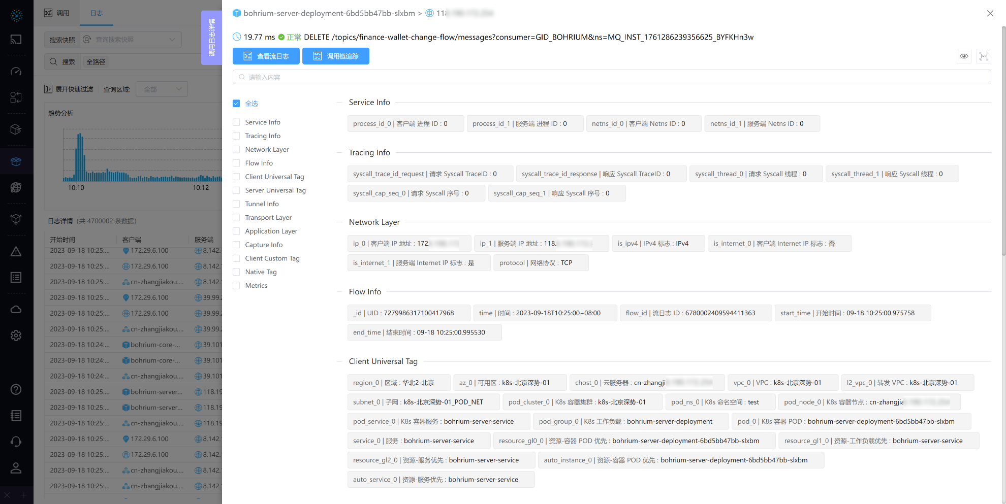
# 1.12 Call Log Details
Call log details display response latency, application protocol, request type, request resource, and response status from client to server at the top of the page. Below the basic information, two buttons perform different actions based on the source of the log data. Below the buttons are the corresponding Tags and Metrics of the log, displayed in key-value pairs for easy access to information.
8_12.png
- Action Buttons:
- View Flow Logs: Only logs originating from the
Packetsignal source can view detailed flow log information. For usage details, refer to the "Flow Log Details" chapter. - Call Chain Tracing: Supports initiating call chain tracing for logs from
eBPForOTelsignal sources. For usage details, refer to the "Call Chain Tracing Details" chapter.
- View Flow Logs: Only logs originating from the
- For operations like searching and filtering tags, refer to the "Knowledge Graph" chapter.
# 1.13 Call Chain Tracing Details
Call chain tracing details are divided into three parts: detailed information of the entry call (root Span) at the top, a flame graph in the middle showing the entire lifecycle of the request, and a detailed information table for each Span at the bottom.

8_13.png
- Usage details of the flame graph, refer to the "Flame Graph" chapter.
- Call Details: Displays the call log of the Span clicked in the flame graph. Clicking it takes you to the 'Call Log Details' page for further viewing.
- Span Traceability: Displays information related to the Span clicked in the flame graph, with associated fields marked by color.
# 1.14 Flow Log Details
Flow log details provide further information on flow logs, with the ability to trace TCP timing and NAT for logs with the TCP protocol.
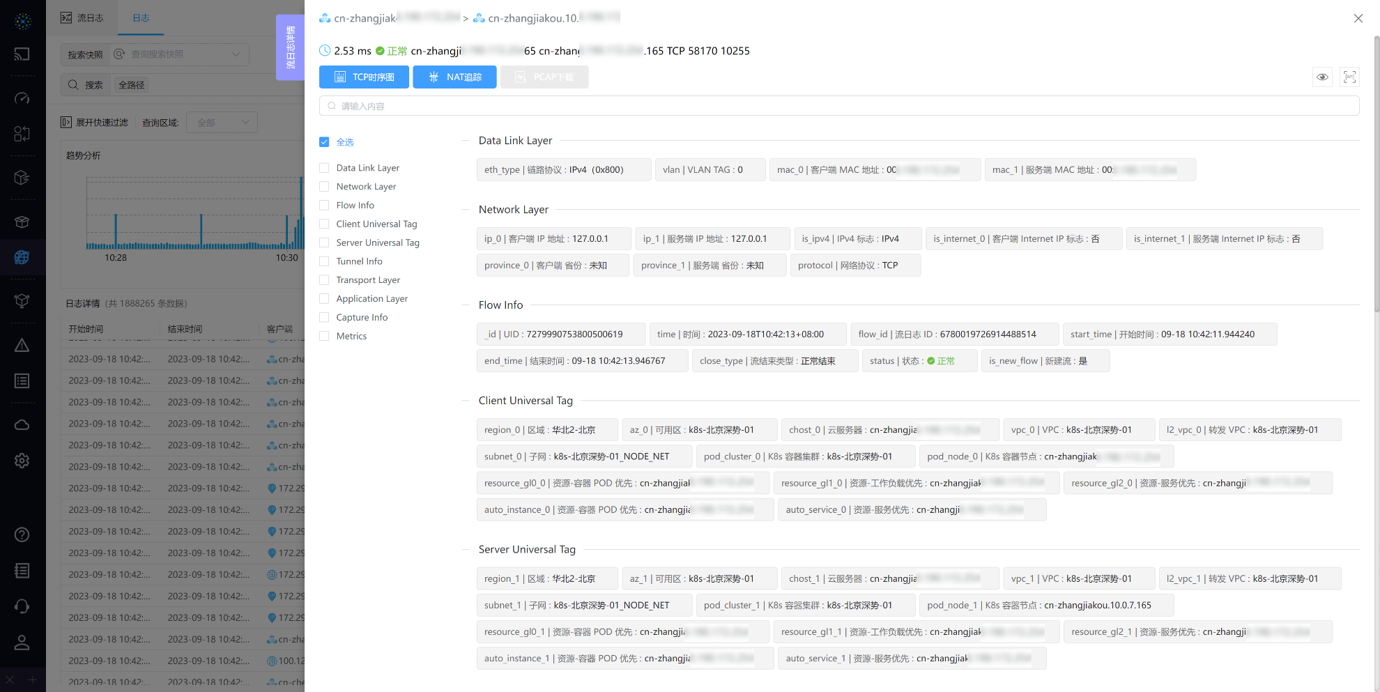
8_14.png
- Action Buttons:
- TCP Timing Diagram: Displays detailed information about each TCP packet header, clearly showing the process of TCP connection establishment, data transmission, and disconnection. For usage details, refer to the "TCP Timing Diagram Analysis" chapter.
- NAT Tracing: Initiate tracing through
five-tuple. For usage details, refer to the "NAT Tracing Details" chapter. - PCAP Download: If there is a matching PCAP strategy for the current data, it can be downloaded.
- For operations, refer to the "Knowledge Graph" chapter.
# 1.15 NAT Tracing Details
NAT tracing details are divided into three parts: information about the initiating flow at the top, network topology on the left (both virtual and physical), and corresponding traffic topology on the right.
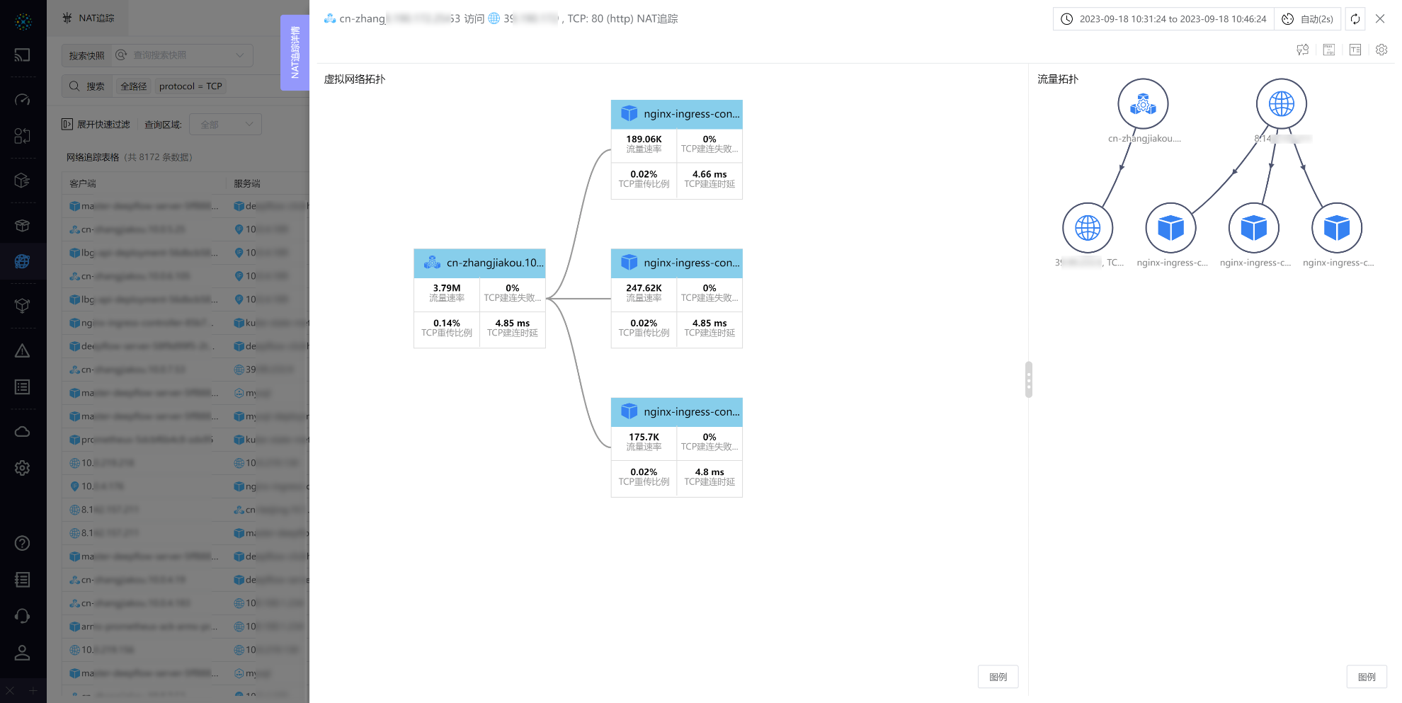
8_15.png
- Traffic Topology: Displays all the tracked traffic in a
free topologyformat. Clicking alineshows detailed information about that path. - Network Topology: Displays the statistical points that the tracked flow passes through in a
waterfall topology.- Virtual Network Topology: Shows statistical points in the virtual network, like client network cards and container nodes.
- Physical Network Topology: Displays collection points in the physical network. Note: Physical network topology is only shown if the tracked flow passes through the physical network.
- Operations:
- Hover over
nodesandlinesfor detailed information, including statistical points, collection points, tunnel information, and metrics.
- Hover over
- Action Buttons:
- Modify Metrics: Allows switching of query metrics.
- Show/Hide Differences: Displays or hides the main metric difference between two adjacent nodes in the
network topology. - Full Name Display: Shows or hides the full name of nodes in the topology.
- Settings:
- Add to View: Allows adding sub-views to the view.
- View API: Basic operations of sub-views, refer to the "Traffic Topology" chapter's "Settings" section in Traffic Topology.
- Close Thumbnail: Toggles the thumbnail in the bottom left corner of the topology.
- Match Algorithm Degree: Adjusts parameters for the NAT tracing algorithm.
- Click the top left corner's time component to filter data by time.
# 1.16 TCP Timing Diagram
The TCP Timing Diagram, through trend analysis graphs and tables, displays detailed information about each TCP packet header, including timestamps, direction, Flags, Seq, Ack, etc., during the process of TCP connection establishment, data transmission, and disconnection. This helps in further analyzing and diagnosing issues in network communication.

8_16.png
- Click the top right corner's time component to filter data by time.
- Timing Table:
- Time, Seq, Ack can be toggled between relative and absolute values by clicking buttons in the table header.
- The interval time is the time difference between the current and the previous row.
- PCAP Download: Supports downloading PCAP files if the current view matches a PCAP policy.